one rAF in · four variables out
--scrollvars
A scroll-animation engine with no framework in the hot path: one listener, one requestAnimationFrame, reads and writes in separate phases. JS computes numbers; CSS does the rest. This entire page runs on it. The panel in the corner shows the live variables of the section in focus. Animation that respects motion preferences from the start.
Use it with your AI agent: npx scrollvars skill
case 1 · entrance
Staggered entrance
The binary trigger: the section crosses the activation band, gains the sv-live class, and its children transition with incremental delays via --sv-order. Pure CSS transitions: React renders nothing during scroll.
One global driver
Every tracked element shares the same loop. 1 or 100 sections: one listener.
Read ≠ write
All getBoundingClientRect calls first, all CSS vars after. Zero layout thrashing.
Reduced motion
Driver and presets honor prefers-reduced-motion: content visible, no movement.
// React. Automatic stagger: no classes on children
import { Reveal } from 'scrollvars/react'

<Reveal as="section" auto>
  <h2>Title</h2>
  <p>Copy</p>
  <div>CTA</div>   {/* sv-skip opts a child out */}
</Reveal>
case 2 · continuous distance
Parallax that follows your finger
--sv-view goes from −1 (entering) to 0 (on stage) to +1 (leaving). The three cards below read the same variable with different distances. And have no transition: continuous value + transition is what causes that rubber-band lag. Scroll up and down here.
/* ready-made preset */
<div className="sv-drift" style={{ '--sv-distance': '13rem' }}>…</div>

/* or custom CSS: the public API is the variables */
.my-parallax {
  translate: 0 calc(var(--sv-view) * -120px);
  opacity: calc(1 - max(var(--sv-view), -1 * var(--sv-view)));
}
case 2b · parallax gallery
Three columns, three speeds
The classic parallax of award-site galleries: columns riding the scroll at different speeds. The middle one against the flow. Depth without 3D: different speed = perceived distance. One line of CSS per column, reading the section's continuous --sv-t.
/* markup: a normal section; register feeds the lerp target:
   track(section, { onTravel: (t) => { target = t } }) */

/* different speed = perceived depth */
.column { translate: 0 calc((0.5 - var(--sv-t)) * var(--speed)); }
.column:nth-child(1) { --speed: 24vh;  }
.column:nth-child(2) { --speed: -34vh;  }  /* against the flow */

// inertia: exponential smoothing: silky in motion, and the stop
// decelerates asymptotically (natural ease-out). One lerp per column:
current += (target - current) * factor   // 0.07…0.16 per frame
col.style.setProperty('--tl', current)
case 3 · pinned scenes
Sticky section with scenes
The pinned-storytelling technique: the section is N screens tall, the content sticks, and scroll becomes an index. The number swaps via callback (React state, integer changes only); the progress bar reads --sv-scene straight from CSS. Zero re-renders while scrubbing.
/* THE PINNED SKELETON. Every pinned case on this page reuses it:
   <div class="outer">          height: 300vh  (the scroll length)
     <div class="sticky">…</div>  position: sticky; top: 0; height: 100vh; overflow: hidden
   </div>
   track(outer, { pin: true })    or  { scenes: N }: writes --sv-pin / --sv-scene */

// React: scene as state, fraction as a CSS var
<Scenes count={4}>
  {({ scene, goTo }) => (
    <div>
      Slide {scene + 1}
      {/* continuous bar, no re-renders: */}
      <i style={{ width: 'calc(var(--sv-scene) / 3 * 100%)' }} />
    </div>
  )}
</Scenes>
case 3b · curtain
Two divs, one pin
The panels read --sv-pin (0→1 across the pinned stretch) and slide in opposite directions. The revealed text's letter-spacing reads the same variable. No JS beyond the driver. Just CSS calc.
one calc() per panel: opposite translates, same variable
/* markup: the pinned skeleton (see case 3) at 250vh;
   the two panels fill the sticky stage side by side */

/* curtain: two panels, opposite directions */
.panel-left { translate: calc(var(--sv-pin) * -101%) 0; }
.panel-right { translate: calc(var(--sv-pin) *  101%) 0; }

// track with pin: true (React: <Track pin>)
track(el, { pin: true })
case 3c · horizontal carousel
Vertical scroll, horizontal travel
The award-site classic: the track travels on the X axis while you scroll on Y. One line of CSS: 100vw − 100% is exactly how much the track overflows the screen.
One listener
The whole page shares a single passive scroll listener.
One rAF
Every section updates in the same frame. Reads first, writes after.
Four vars
--sv-view, --sv-t, --sv-pin, --sv-scene. Any CSS that reads them is a preset.
Zero deps
No GSAP, no framework in the hot path. Driver: 5.7 KB gzip.
Infinite presets
Curtain, carousel, 3D, scrubbed video. It is all the same handful of numbers.
/* markup: pinned skeleton at 300vh; inside the sticky stage:
   <div class="track"> …cards… </div>   +   track(outer, { pin: true }) */

/* the track overflows the screen; the pin pays the difference */
.track {
  width: max-content;
  translate: calc((1 - var(--sv-pin)) * 100vw
           + var(--sv-pin) * min(100vw - 100%, 0px)) 0;
  /* enters from offscreen right; min() keeps it moving on wide windows */
}
case 3d · card deck
A deck that deals itself
Four stacked cards; each clips its own slice of --sv-pin with a clamp and flies away on its turn. All the sequencing is CSS. No state, no callbacks.
Batched reads
Every getBoundingClientRect of the frame happens together, before any write.
Just arithmetic
view, t, pin and scene come from the same four sums per element.
Vars, not styles
The driver writes numbers. Your CSS decides what they mean.
Keep the frame light
No scroll values in React state. Keep tracked wrappers thin and measure the whole frame.
/* markup: pinned skeleton at 400vh; sv-deck is the sticky stage's child
   track(outer, { pin: true }) */

/* official preset since v0.7. Children stack via grid, auto-indexed */
<div class="sv-deck" style="--sv-count: 4"> …4 cards… </div>

/* under the hood: each card clips its own slice of the pin */
--sv-slice: clamp(0, calc(var(--sv-pin) * var(--sv-count) - var(--sv-order)), 1);
translate: 0 calc(var(--sv-slice) * -130vh);
rotate: calc(var(--sv-slice) * -7deg);
case 3e · guided reading
Text that lights up word by word
The manifesto effect of award sites: every word becomes a span with an index, and opacity compares that index against --sv-pin. JS splits the text once. The rest is one clamp per word.
Scroll animation is not about moving pixels. It is about pacing the reading: every section arrives on cue, every number tells its story, and the whole page breathes at the pace of the finger that scrolls it.
/* markup: pinned skeleton at 300vh; split the text into <span>s with
   --sv-order 0..n and set --sv-count on the container
   track(outer, { pin: true }) */

/* official preset since v0.7: sv-reading + --sv-count on the container,
   --sv-order per word span. One rule for every word: */
.sv-reading > * {
  opacity: clamp(var(--sv-reading-floor, 0.55), calc(var(--sv-pin) * (var(--sv-count) + 3) - var(--sv-order)), 1);
}
case 3f · counter
From 0 to 421 without JavaScript
@property types the variable as an integer and counter() prints it. The driver only writes the pin. The counting number is 100% CSS.
/* markup: pinned skeleton at 220vh
   track(outer, { pin: true }) */

/* official preset since v0.7 */
<div class="sv-counter" style="--sv-max: 421"></div>

/* under the hood: a typed custom property makes the value countable */
@property --sv-int { syntax: '<integer>'; initial-value: 0; inherits: true; }
.sv-counter {
  --sv-int: calc(var(--sv-pin) * var(--sv-max));
  counter-reset: sv-counter var(--sv-int);
}
.sv-counter::after { content: counter(sv-counter); }
case 3g · scrubbed video
The scroll is the timeline
The technique behind cinematic "3D" (Apple product pages): the scene is pre-rendered and the scroll picks the frame. Forward and backward. This is a frame sequence on canvas, not a <video>: video decoders keep state and Safari's wedges under fast bidirectional seeking. Images are stateless: there is nothing to get stuck.
/* markup: pinned skeleton at 300vh with a <canvas> in the sticky stage;
   frames extracted once:  ffmpeg -i clip.mp4 -vf 'fps=6,scale=640:-2' f%02d.jpg */

// the callback gets the raw pin; the frame index is one line
track(section, { pin: true, onPin: (p) => {
  ctx.drawImage(frames[Math.round(p * (frames.length - 1))], 0, 0)
}})

// video.currentTime works too (Chromium). But decoders keep state;
// for bulletproof cross-browser scrubbing, ship frames (like Apple does)
case 4b · kinetic typography
One word in four acts
The layered-choreography idiom: the continuous scene becomes "frame slices" (--f1…--f4) and each act choreographs one thing. Letters are born scattered, the word assembles, a continuous wave rolls through it (notice: it follows your finger, no transition) and color sweeps letter by letter. Two triggers living on the same element. Snapped states with transition, continuous without.
/* frame slices: each act clips 1 unit of the scene */
--f2: clamp(0, calc(var(--sv-scene) - 1), 1);

/* discrete act (snap + transition): the word assembles */
.letter { translate: calc(var(--sx) * (1 - var(--f2))) …; }

/* continuous act (no transition): the wave follows the finger */
.letter i { translate: 0 calc(sin(var(--i) * 55deg + var(--f3) * 540deg) * -0.22em); }

/* act 4: color sweeps, one letter at a time */
--lit: clamp(0, calc(var(--f4) * 12 - var(--i)), 1);
color: color-mix(in oklab, var(--accent) calc(var(--lit) * 100%), var(--text));
case 4c · choreographed collage
Every object arrives its own way
The editorial pattern of award sites: elements enter from different corners, each with its own vector, curve and timing. One bounces (overshoot curve), one slides, one spins. No once latch here: leave the section and they fly back out; return and the choreography replays. The scroll conducts it in both directions.
/* markup: a normal section tracked with { once: true }:
sv-live latches and every item plays its own entrance */

/* each item declares its own entrance */
<div class="collage-item" style="--ex:-60vw; --er:-180deg;
     --curve:cubic-bezier(0.34,1.56,0.64,1)">  /* bounces */

.collage-item { translate: var(--ex) var(--ey); rotate: var(--er); opacity: 0; }
.sv-live .collage-item { translate: 0 0; rotate: 0deg; opacity: 1; }
case 4d · svg path
A line that draws itself (and the dot that rides it)
Two tricks on the same curve: pathLength="1" + stroke-dashoffset draw the stroke, and the dot travels the SAME path in the SVG's own units. The scroll does the driving. Including in reverse.
/* markup: pinned skeleton; the SVG (path + circle) fills the sticky
   stage;  pathLength=1 on the path makes the dash math unitless */

/* the stroke draws itself */
path { stroke-dasharray: 1; stroke-dashoffset: calc(1 - var(--sv-pin)); }

// and the dot rides the SAME path, in SVG units
onPin: (p) => {
  const pt = path.getPointAtLength(p * path.getTotalLength())
  car.setAttribute('cx', pt.x); car.setAttribute('cy', pt.y)
}
/* offset-path works for HTML elements. But uses document px;
   inside a scaled SVG, getPointAtLength is the exact alignment */
case 5 · 3D product tour
Each scene, one angle of the object
The award product-page pattern: the object turns to the right angle for each scene and a card presents that part. The camera interpolates between orientation targets, three.js with no loop of its own (one frame per scroll). And the cards crossfade in pure CSS, reading --sv-scene.
Precision front end
Each scene defines a rotation and zoom target; the camera eases between them.
Aerodynamic profile
The card you are reading crossfades in pure CSS. Opacity derived from the distance to its scene.
Sculpted rear
A real model (embedded GLTF). Swap the duck for a client product: same code, different .glb.
Top view
Zero requestAnimationFrame of its own: one frame per scroll event. The GPU sleeps the rest.
// one orientation target per scene; the pin interpolates between them
const TARGETS = [
  { ry: -0.55, zoom: 1.12 },  // the beak
  { ry: 1.82,  zoom: 0.92 },  // the wing
  { ry: 3.59,  zoom: 0.98 },  // the tail
  { ry: 5.73,  rx: 0.5 },    // high view
]

/* and the cards swap on their own, no JS: */
.card { opacity: clamp(0, calc(1 - abs(var(--sv-scene) - var(--i)) * 1.5), 1); }
case 4 · 3D on scroll
Three ways to do "3D"
The card below is pure CSS 3D: one rotateY reading --sv-t. No WebGL, no library: and it already covers plenty of client work. The other two paths are in the code below.
/* 1 · CSS 3D (this demo). Cheap, runs on any phone */
.card3d { transform: rotateY(calc(var(--sv-t) * 240deg)); }

// 2 · Scrubbed video (pre-rendered 3D scene,
//     the scroll only drives the clock)
useTrack({ onTravel: (t) => {
  video.currentTime = t * video.duration
}})

// 3 · Real-time WebGL (React Three Fiber). When the client
//     needs INTERACTION: rotate, recolor, day/night
useTrack({ scenes: 4, onScene: (i) => camera.lookAt(points[i]) })
case 6 · pointer tilt
Cards that look back at you
Same philosophy, different input: the pointer becomes two variables (--mx/--my, −1 to 1 from the card's center) and CSS does the tilt, the glare and the layered depth (translateZ). One delegated listener for the whole row, writes batched in a rAF. The driver's rules, applied to the mouse.
Tilt
perspective + rotateX/Y reading the pointer vars. The card leans toward the cursor.
Glare
A radial-gradient whose center mirrors the pointer. The "reflection" is one line of CSS.
Depth
Inner layers float at different translateZ heights, so the parallax is real 3D, not fake offsets.
/* the pointer becomes two variables; CSS does the rest */
.card {
  transform: perspective(900px) rotateY(calc(var(--mx) * 14deg))
             rotateX(calc(var(--my) * -14deg));
}
.card::after {  /* glare mirrors the pointer */
  background: radial-gradient(circle at
    calc(50% + var(--mx) * 38%) calc(50% + var(--my) * 38%),
    rgba(255,255,255,.14), transparent 42%);
}
case 7 · ambient canvas
A canvas that sleeps when you leave
Ambient effects (particle spheres, generative heroes) are time-driven, not scroll-driven. A different paradigm, so they live in their own module: scrollvars/canvas. The simulation stays yours; the harness owns the lifecycle everyone rewrites badly: resize, DPR cap, delta-time loop, auto-pause when offscreen or the tab hides, reduced-motion, cleanup. Watch the frame counter: scroll away and come back: it didn't move. Most ambient canvases burn CPU forever; this one sleeps. And the scroll still feeds it: onTravel drives the wave height below.
import { mountEffect } from 'scrollvars/canvas'  // or useCanvasEffect in React

mountEffect(canvas, {
  setup:  (fx) => { /* build your particles */ },
  frame:  (fx, dt) => { /* one step; dt in seconds, ctx pre-scaled to CSS px */ },
})
// resize + DPR cap · pauses offscreen & on hidden tab · fx.reducedMotion live
// WebGL/Three: { context: null }: your renderer owns the canvas, the harness the lifecycle
// scroll input crosses over by closure, the modules stay decoupled:
track(section, { onTravel: (t) => { amplitude = t } })
case 8 · warp
Scroll becomes depth
A pinned canvas where --sv-pin stops meaning "down" and starts meaning "forward": the scroll flies the camera through a starfield (velocity stretches the stars into streaks), then the whole stage fades and the page simply… continues. You traveled somewhere to keep reading.
scroll = thrust
No route change, no transition library. One pinned track, one canvas, and a fade driven by the same variable that drove the stars.
/* markup: pinned skeleton at 300vh; <canvas> fills the sticky stage,
   mounted with mountEffect (the harness renders only while visible) */

// the pin drives the camera; the harness only renders while visible
track(section, { pin: true, onPin: (p) => { thrust = p } })

/* the exit is pure CSS. Same variable, no JS choreography */
.stage { opacity: clamp(0, 5.5 - var(--sv-pin) * 6.2, 1); }
case 9 · organic blobs
Soft bodies that dodge the pointer
Six radial-gradient blobs drifting on slow sine paths, composited with screen blending. The organic-hero look. Move the mouse: each blob is pushed away with a spring (offset += (target − offset) × 0.06) and eases back when you leave. Same harness as the others, so it also sleeps offscreen.
// pointer physics stay in userland; the harness just gives the loop
mountEffect(canvas, {
  frame: (fx, dt) => {
    blob.ox += ((push.x - blob.ox)) * 0.06   // spring toward (or back from) the pointer
    fx.ctx.globalCompositeOperation = 'screen'
    // radial gradient per blob. Soft edges do the "organic" work
  },
})
case 10 · scroll-snap, regional
A magnet only where you want it
Scroll-snap is the browser's native magnet. But declared on <html> it would magnetize the whole page and fight every pinned section. The trick: onLive toggles a class on the root, so the snap exists only while these three panels are on screen. Proximity, not mandatory: free in between, magnetic near the seams. The variables keep flowing during the settle: watch the entrances.
release the scroll near an edge. It settles
proximity: the middle of a long scroll stays free
leave the region and the magnet is gone
/* the magnet, scoped: active only while the group is live */
html.snap-region { scroll-snap-type: y proximity; }
.panel { scroll-snap-align: start; height: 100vh; }

track(group, { onLive: (live) =>
  document.documentElement.classList.toggle('snap-region', live)
})
// proximity, never mandatory, on a page with pinned sections,
// mandatory would forbid resting mid-pin
case 11 · snap flavors
Four magnets, one carousel
Same inner scroller, four scroll-snap configs. Drag it after each switch. free: no snap, momentum decides. proximity: settles when you stop near a card. mandatory: always lands centered on a card. stop: mandatory + scroll-snap-stop: always: one card per gesture, the slideshow feel. All of it is CSS; no library required, and none of it fights the driver.
drag me sideways
then switch the mode
feel the difference
stop = one per gesture
all native CSS
zero JS in the magnet
.carousel { overflow-x: auto; scroll-snap-type: x proximity; }  /* or x mandatory */
.carousel > * { scroll-snap-align: center; }
.carousel.slideshow > * { scroll-snap-stop: always; }  /* one card per gesture */
case 12 · the treasure map
The page doesn't scroll. The camera travels
A 2400×1800 world, a dashed route, and one inversion: the scroll is fuel for a camera following an SVG path. getPointAtLength gives the position, a point sampled just ahead gives the heading, and the whole world counter-rotates so you always travel "forward". Right, down, around the bend. One composited transform; the browser never lays out the world. The cards counter-rotate to stay readable.
You start here
Scroll: the camera casts off along the dashed route.
First bend
The heading comes from a point sampled just ahead on the path. Atan2, nothing more.
Crossing back
One transform on one composited layer. The whole world never re-lays-out.
The long way round
Inertia is the same exponential lerp as everywhere else in this page.
X marks the spot
The treasure was a performant scroll story all along.
/* markup: pinned skeleton at 500vh. Inside the sticky stage:
   <canvas>                       grid + dashed route, redrawn per frame
   <div class="world">…stations…  transform-only layer, paints ONLY cards
   <svg hidden>path</svg>         geometry source for getPointAtLength */

// the camera: position from the path, heading from a point just ahead
track(rail, { pin: true, onPin: (p) => { target = p } })

// per frame (inertia lerp): put P at screen center, face the travel direction
const a = route.getPointAtLength(t * len)
const b = route.getPointAtLength(Math.min(t * len + 40, len))
const ang = Math.atan2(b.y - a.y, b.x - a.x)
world.style.transform =
  `translate(${cx}px,${cy}px) rotate(${-ang}rad) translate(${-a.x}px,${-a.y}px)`
world.style.setProperty('--map-ang', ang + 'rad')  // cards counter-rotate
case 13 · the slider module
The 3.7 KB carousel, 11× lighter than Swiper
slider(el). The browser does the carousel (native scroll, momentum, touch) and scroll-snap does the magnetism; the module adds mouse drag, next/prev, and the observer: each slide gets --sd (signed distance from center) and .sv-active. The coverflow below: scale, fade, rotateY: is pure CSS reading --sd. Drag it with the mouse, fling it on touch, or use the arrows. And the vertical rail beside it is a second slider (axis: 'y') chained in one line: onScroll: (s) => thumbs.seek(s.progress). The numbers, measured from jsDelivr: Swiper 11 ships 151 KB minified (42 KB gzipped, +18 KB of CSS); this module is 9.1 KB minified, 3.7 KB gzipped, ~11× lighter. Because the browser already ships the hard parts.
/* markup. The whole carousel:
   <div class="sv-slider" id="el"> <div>…slide…</div> ×N </div>
   import { slider } from 'scrollvars'   (styles.css ships the base CSS) */

const s = slider(el, { duration: 1400, onSlide: (i) => dots.select(i) })  // or useSlider() in React
s.next(); s.prev(); s.goTo(3)

/* the coverflow: every slide reads its own --sd */
.slide {
  scale: calc(1 - abs(var(--sd)) * 0.13);
  transform: perspective(900px) rotateY(calc(var(--sd) * -18deg));
}// the page's vertical scroll becomes the carousel's fuel
track(rail, { pin: true, onPin: (p) => {
carousel.scrollLeft = p * (carousel.scrollWidth - carousel.clientWidth)
}})
// one writer only: overflow-x hidden turns off direct swiping here,
// or the two scrolls desync, JS can still write scrollLeft freelycase 14 · the wheel
A vertical slider wearing 3D
The same module with axis: 'y', styled like an iOS picker: each option rotates on X by its own --sd and fades with distance. A drum you spin with wheel, drag or touch. Snap is the detent; onSlide is the value.
/* markup: same .sv-slider container, tall padding creates the
   pick-line; a fixed overlay draws the detent lines */

slider(el, { axis: 'y', onSlide: (i) => pick(OPTIONS[i]) })

.wheel > * {
  transform: rotateX(calc(var(--sd) * -34deg)) translateZ(10px);
  opacity: calc(1 - abs(var(--sd)) * 0.38);
}
case 15 · the flavor wheel
A slider that rotates below the fold
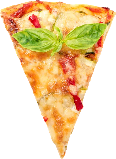
The hub sits under the bottom edge, so only the top arc shows. The scroll owns the rotation (scenes eases and snaps --sv-scene, and the disc reads it: rotate: calc(var(--sv-scene) * -72deg)); the arrows don't touch the wheel at all. They scroll the page to the matching scene, so scroll and clicks never fight: one writer. Slices are transparent WebP, dimming and shrinking by their distance from the top.
ScrollVars pizzeria
I'm tempted by pepperoni
spicy, loud and always hot
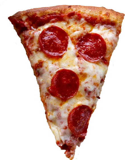
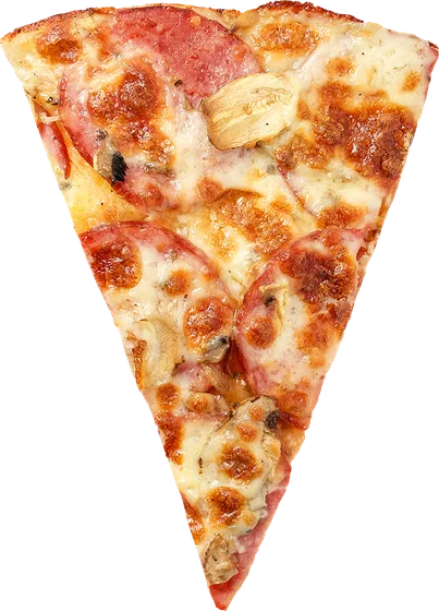
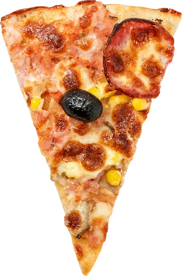
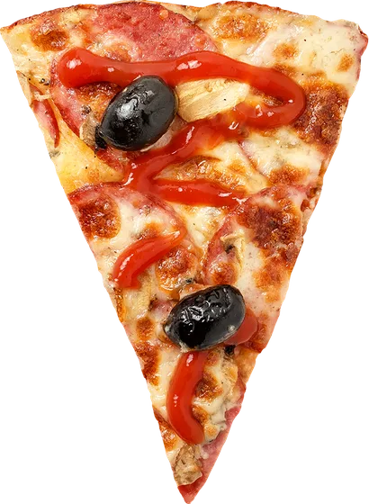
/* markup: pinned skeleton at 300vh. In the sticky stage:
   <div class="hub"> <div class="slice" style="--i:0"><img>… ×5 </div>
   hub sits at left:50%; top:calc(100% + 8vh): the center below the fold */

// scroll owns the wheel; buttons just drive the scroll. One writer
track(section, { scenes: 5, onScene: (i) => setFlavor(FLAVORS[i]) })
nextBtn.onclick = () => scrollToScene(section, current + 1, 5)

// the magnet: a quiet scroll mid-pin settles onto the nearest flavor,
// no resting position between two pizzas (quiet-debounce + smooth scroll)
onQuiet(() => scrollToScene(section, Math.round(pin * 4), 5))

.hub   { rotate: calc(var(--pz-scene) * -72deg); }  /* --pz-scene = lerped --sv-scene */
/* GOTCHA: individual props apply in fixed order translate→rotate,
   radial math needs the shorthand, where the order is literal: */
.slice { transform: rotate(calc(var(--i) * 72deg)) translateY(-470px); }
case 16 · window parallax
Every card is a window
The award-site gallery: each slide holds two oversized scenery layers moving at different speeds. Mountains at calc(var(--sd) * 8%), foreground at 26%. And the differential is what your eye reads as depth, like scenery through a train window. Still just CSS reading --sd; the scenes are inline SVGs, ~600 bytes each.
case 17 · the CSS timeline
Multi-act, no timeline engine
What it is: sv-acts. A master clock in a registered custom property. When the class lands (a click via toggles(), or sv-live from the scroll), --sv-act transitions from 0 to N, and every act reads its slice of the clock. The same clamp() idiom the scroll scenes use. What it's for: intros, hero choreographies, menu sequences. Anything linear. Press play; press again mid-flight and watch it reverse from wherever it is. The transition retargets, it never restarts. This case ships zero JavaScript of its own.
three acts
one property is the whole timeline
/* the clock: one registered property in transition. That's the engine */
@property --sv-act { syntax: '<number>'; initial-value: 0; inherits: true; }
.sv-acts { --sv-act: 0; transition: --sv-act 2.4s linear; }
.sv-acts.sv-open { --sv-act: 3; }

/* acts = slices; sub-slices stagger inside an act (the chips) */
--a2: clamp(0, calc(var(--sv-act) - 1), 1);
.chip { --chip: clamp(0, calc(var(--a2) * 3 - var(--i)), 1); }

/* the same sequence in GSAP, the market reference: */
//   gsap.timeline().to('.title',{…}).to('.chip',{stagger:.2},'-=.2').to('.line',{…})
//   → identical result, plus a 28 KB core on the page.
// Where GSAP legitimately goes further. And sv-acts stops:
//   branching mid-timeline · per-act JS callbacks · spring physics ·
//   exotic eases on the clock itself · nested master timelines.
//   Linear sequence? You don't need the engine.
case 18 · the spread
A deck that deals itself into the grid
Cards live in their final flex row; a per-card translate collapses them onto the center (with a slight fan) while --sv-spread is 0. The same preset, two clocks: the first row plays on arrival (sv-live flips the variable, transitions play with a stagger. Scroll away and back, it re-deals); the second is scrubbed: --sv-spread maps from --sv-t, so the deal follows your finger both ways. Zero JavaScript of its own.
on arrival · plays once live
scrubbed · follows the scroll
/* cards sit in their real flex row; the deck is just a translate */
.sv-spread > * {
  --sv-d: calc(var(--sv-order) - var(--sv-mid, 1));  /* slots from center */
  translate: calc(var(--sv-d) * (var(--sv-spread, 0) - 1) * (100% + 16px)) 0;
  rotate: calc(var(--sv-d) * (1 - var(--sv-spread, 0)) * -5deg);
}

/* clock 1: on arrival: sv-live flips the var, transitions deal the cards */
.sv-live .sv-spread-in > * { --sv-spread: 1; }

/* clock 2: scrubbed: map it from the driver (spread done by mid-viewport) */
.spread-scrub > * { --sv-spread: clamp(0, calc(var(--sv-t) * 2), 1); }
use it
In your Next.js project, in one minute
Everything on this page renders on the server: the React layer is thin 'use client' wrappers whose children stay Server Components, hiding styles only exist after the driver boots (html.sv-on), so there is no hydration flash and no-JS visitors get the complete page. This is the lightest way to animate a page that we know how to measure. The receipts are above.
# install
npm i scrollvars

// app/layout.tsx: one client component, the whole wiring
import { ScrollVarsBoot } from 'scrollvars/react'
import 'scrollvars/styles/core.css'   // or styles.css for everything

<body><ScrollVarsBoot />{children}</body>

// any page: plain Server Components, Tailwind as usual
<section data-sv data-sv-once className="py-24">
  <h2 className="sv-rise text-4xl">Title</h2>
  <p className="sv-rise" style={{ '--sv-order': 1 }}>Copy</p>
</section>

// responsive knobs ARE Tailwind arbitrary properties:
<Slider className="[--sv-per-view:1.2] md:[--sv-per-view:2.5] xl:[--sv-per-view:4]" arrows dots>
  {cards.map(c => <Slide key={c.id}><Card {...c} /></Slide>)}
</Slider>
Machine-readable docs for AI assistants: /llms.txt: the full API, recipes and performance rules, ready to ingest.
accessibility · tested
Give visitors control over motion. Put accessibility to the test.
Every preset honors reduced motion automatically, and the page gets its own switch (the Motion button in the bar above). The kit's carousel follows the APG pattern: a visible pause control, paused from the start under reduce, 24px targets. Keyboard, axe, reflow and motion gates test this site in CI on every commit, serving WCAG 2.3.3, 2.2.2, 4.1.2, 2.1.1, 2.5.8, 2.4.11, 1.4.10 and 1.4.4. These safeguards support your accessibility work; they do not establish your page's conformance.
GSAP and Framer Motion are stronger for heavy, time-based choreography and leave reduced motion to the author. ScrollVars builds it into every preset, ships the switch and the carousel controls, and tests its own site. The full contract, criterion by criterion, is in the docs and the README.
reference · measured
The receipts
Every number below was measured, not quoted. Competitors from their public CDN builds, ScrollVars via esbuild+gzip on its own source (it wasn't on a CDN to be measured); workload and machine identical, methodology on the benchmark page, where you can run all of it on your own hardware.
Weight on the wire (min / gzip)
| framer-motion 11 | 144 KB / 46.9 KB | + React |
| GSAP + ScrollTrigger | 114.7 KB / 45.2 KB | |
| Swiper 11 bundle | 151 KB / 42 KB | + 18 KB CSS |
| ScrollVars. Everything | not tracked / 23.4 KB | core + slider + all presets CSS |
| ScrollVars. Typical page | ~8.8 KB gz | track + styles/core.css (tree-shaken) |
| ScrollVars driver alone | 15.9 KB / 5.7 KB |
CPU cost during scroll (12s scroll, 900 elements; package 1.16.1, 3 runs, measured 2026-09-10T23:55:45.351Z)
| engine | total CPU (12s) | fps | JS script | style recalc | JS heap |
|---|---|---|---|---|---|
| ScrollVars (page outputs on) | 679 ms | 60 | 59 ms | 137 ms | 1 MB |
| scrollvars-scoped.html | 766 ms | 60 | 46 ms | 188 ms | 1 MB |
| scrollvars-page.html | 3791 ms | 59.3 | 49 ms | 2604 ms | 1.1 MB |
| GSAP + ScrollTrigger (idiomatic) | 659 ms | 60 | 145 ms | 57 ms | 6.1 MB |
| GSAP + ScrollTrigger (batched) | 626 ms | 60 | 117 ms | 59 ms | 6.8 MB |
| framer-motion | 1078 ms | 60 | 490 ms | 42 ms | 10.9 MB |
Total CPU is accumulated main-thread task time, not per-frame time. Page outputs off applies only when no CSS consumes the global clocks. Raw runs; frame tails and methodology.
Frame delivery and CPU cost depend on the workload, browser and device. The benchmark records startup separately, includes slow frames and compares document-wide outputs enabled and disabled. Synthetic CPU throttling is not a physical-phone test. Inspect the dated results and run it yourself →
reference
The API is a handful of variables
Any CSS that reads these variables is a valid preset. That is what keeps the library small and flexible at once: the presets are just examples. And to replicate any demo above: each case's snippet carries its markup skeleton and registration, this page ships unminified, so View Source is the complete implementation. For ready-to-paste versions (Tailwind, CSS and React, with a copy button and a shadcn-style npx scrollvars add), see the growing fx gallery. Copy freely.
| var | range | meaning |
|---|---|---|
--sv-view | −1 → 0 → 1 | Entering from below → on stage → leaving above |
--sv-t | 0 → 1 | Travel through the viewport. Same semantics as native view() |
--sv-pin | 0 → 1 | Raw progress across the pinned stretch. Curtains, carousels, scrubbing |
--sv-scene | 0 → n−1 | Scene of the pinned section, eased and snapped |
--mx --my | −1 → 1 | Pointer position from the element's center (trackPointer). Tilt, glare |
.sv-live | class | On while inside the activation band (75% / 25%). Fires the entrances |
// vanilla. No React at all
import { track } from 'scrollvars'

const untrack = track(el, {
  scenes: 4,
  onScene: (i) => console.log('scene', i),
})
reference
Browser support
The floor is set by ES2020 in the dist and individual transform properties in the presets. The rule that matters for production: below the floor nothing breaks. The html.sv-on guard means hiding styles only exist after the driver boots, so older browsers (and no-JS) get the complete page, static. Animation is progressive enhancement, never a dependency.
| browser | fully animated | notes |
|---|---|---|
| Chrome / Edge | 104+ · Aug 2022 | sv-view-* native zero-JS tier: 115+ |
| Firefox | 78+ · Jun 2020 | sv-counter preset: 128+ |
| Safari / iOS | 14.1+ · Apr 2021 | sv-counter preset: 16.4+ |
with scrollvars/compat | ~Chrome 61 · FF 60 · Safari 11 | opt-in module: stubs + transform fallback presets; free on modern browsers |
| older / no JS | static | content 100% visible. Nothing breaks |
bibliography
Go deeper
Nothing here is an isolated invention: scroll-driven animation is a public lineage more than a decade deep. From data-journalism scrollytelling to Apple's product pages to the native CSS spec. These are the sources at the base.
The native, scroll-driven animations
- CSS scroll-driven animationsMDN. The native API reference (animation-timeline, view(), scroll())
- Animate elements on scroll with scroll-driven animationsBramus Van Damme, Chrome for Developers. The canonical guide
- scroll-driven-animations.styleBramus's official gallery of demos and tools
- Scroll-driven Animations (spec W3CCSS Working Group) the spec text
- scroll-timeline polyfillRob Flack (Google). The reference polyfill
Technique & inspiration
- Let's make one of those fancy scrolling animations used on Apple product pagesCSS-Tricks. The scrubbed frame-sequence classic (this page's "scrubbed video")
- How to implement scrollytellingThe Pudding. The data-journalism lineage where the genre was born
- An interactive guide to scroll-driven animationsAhmad Shadeed. The best visual guide to the mental model
- The future of CSS: scroll-linked animationsBramus: the series that anticipated the spec
- Trigonometric functions in CSSweb.dev. The cos()/sin() used in the choreography here
Performance. Why the driver is built this way
Reference tools & accessibility
- GSAP ScrollTriggerthe commercial reference implementation of the same model (pin, scrub, snap)
- Lenisdarkroom.engineering. The smooth scroll behind award sites
- Designing safer web animation for motion sensitivityVal Head, A List Apart. Why reduced-motion is not optional
- prefers-reduced-motionweb.dev. The practical implementation of respecting the user